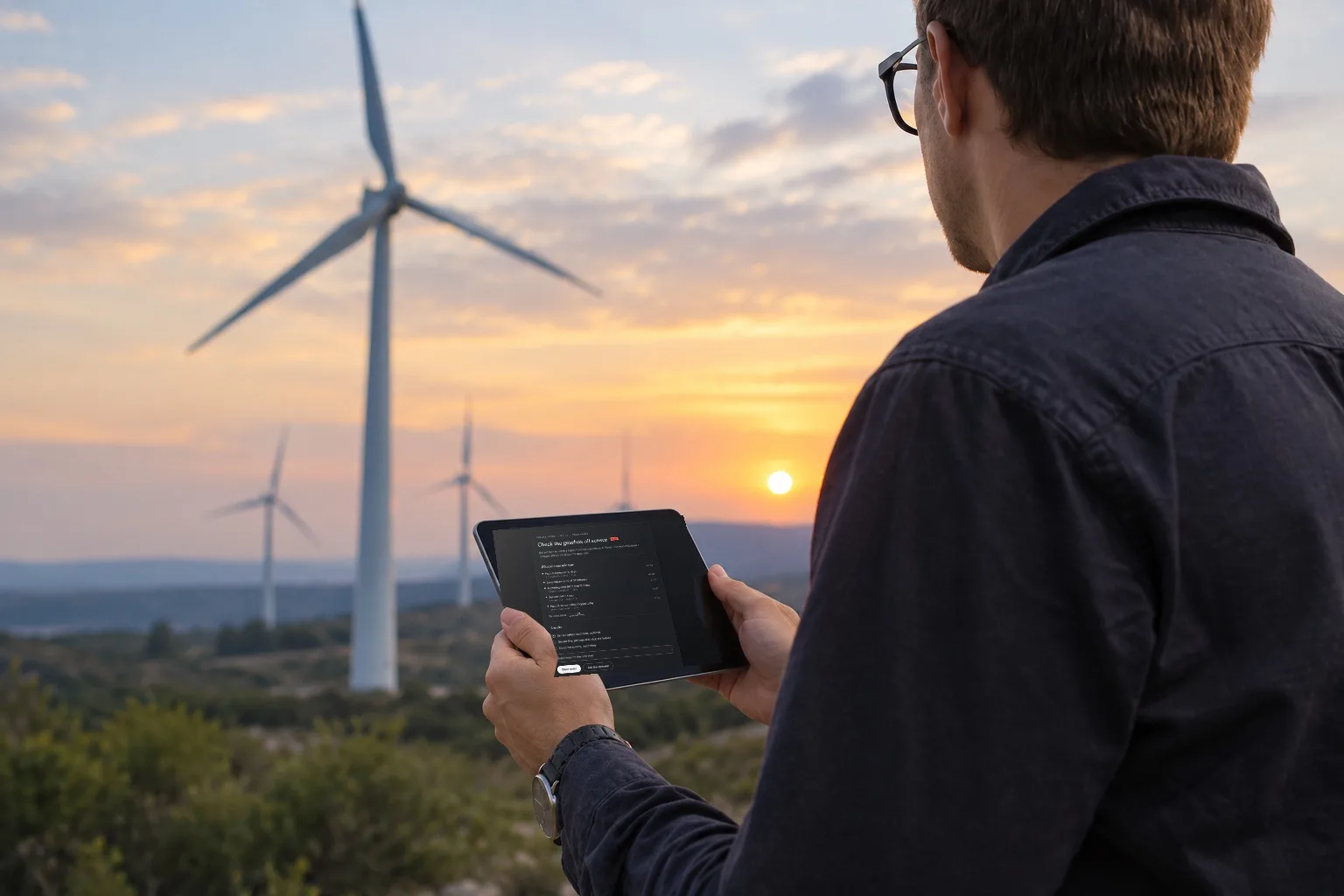
An operator has three ways out of a flag, and two of them cost money
A wind farm reports every ten minutes: wind speed, power, gearbox oil temperature, drive train acceleration, metal particles in the oil. A model compares today’s pattern against machines that failed before and returns a probability. On the screen it arrives as one turbine, lifted out of a list of twenty, with a number beside it.
The gearbox is the expensive part. Replacing one needs a crane and costs in the hundreds of thousands. Caught early enough, the same fault is a bearing swapped during a stop that was already planned. That gap between an early bearing and a late gearbox is the entire reason the model exists.
The operator has three ways out, and no good one. Send a technician, and the visit is billed whether or not anything is found. Keep watching, and accept that watching is not free either, because the machine keeps turning while the decision is deferred. Dismiss the flag, and own it if the gearbox goes.
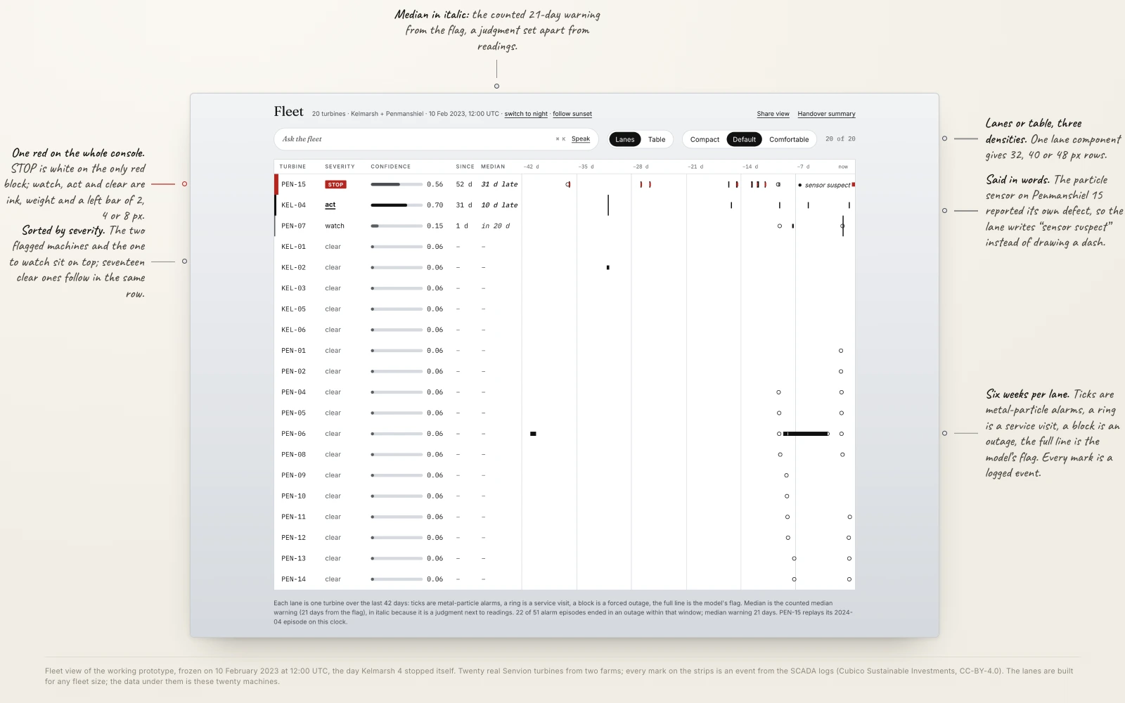
So the console opens on the whole fleet, not on a notification. Each turbine is a lane over the last six weeks: alarms as ticks, service visits as rings, outages as blocks, the model’s flag as a full line. Beside the lane sit the severity, the confidence with its bar, the days since the flag, and the counted median warning in italic, because it is a judgment set next to readings. The two flagged machines and the one to watch sit on top; seventeen clear ones follow in the same row. The same row also exists as a table, at three densities, from one component.
Everything the interface claims is counted from nine years of real turbine logs
There is no invented client here and no fictional brief. The console runs on open SCADA data from two British wind farms, Kelmarsh and Penmanshiel, released by Cubico Sustainable Investments under CC-BY-4.0: twenty Senvion turbines, readings every ten minutes, 1.57 million logged events between 2016 and 2024.
The signals the model leans on are real and they are named in the export: gear oil temperature, gear oil inlet pressure, front and rear bearing temperature, drive train acceleration, and a metal particle count in the gear oil. Of 299 columns, 107 carry data and 191 are empty for the whole year. The export marks anything missing or erroneous as NaN rather than zero, which is the distinction the interface has to keep: a zero is a measurement, a blank is the absence of one.
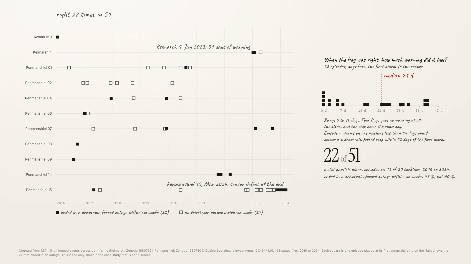
The sentence the confidence panel quotes is counted, not assumed. Across both farms I grouped the metal particle alarms into episodes, alarms on one machine less than fourteen days apart, and checked what followed each one. Fifty-one episodes on eleven turbines. Twenty-two ended in a drivetrain forced outage inside six weeks. When the signal was right, the median warning it bought was twenty-one days; four times it bought none at all.
One number needed correcting before it could be used. The condition monitoring channels show only 65% coverage across 2016, which looks like a sensor dropping out. It is not. Those channels do not exist before May 2016 and run at 95 to 100% afterwards, so the gap is a commissioning date, not a fault. An interface built on the first reading would have been designed around a problem that was never there.
Fifty-eight per cent of the log is the turbine saying that it is fine
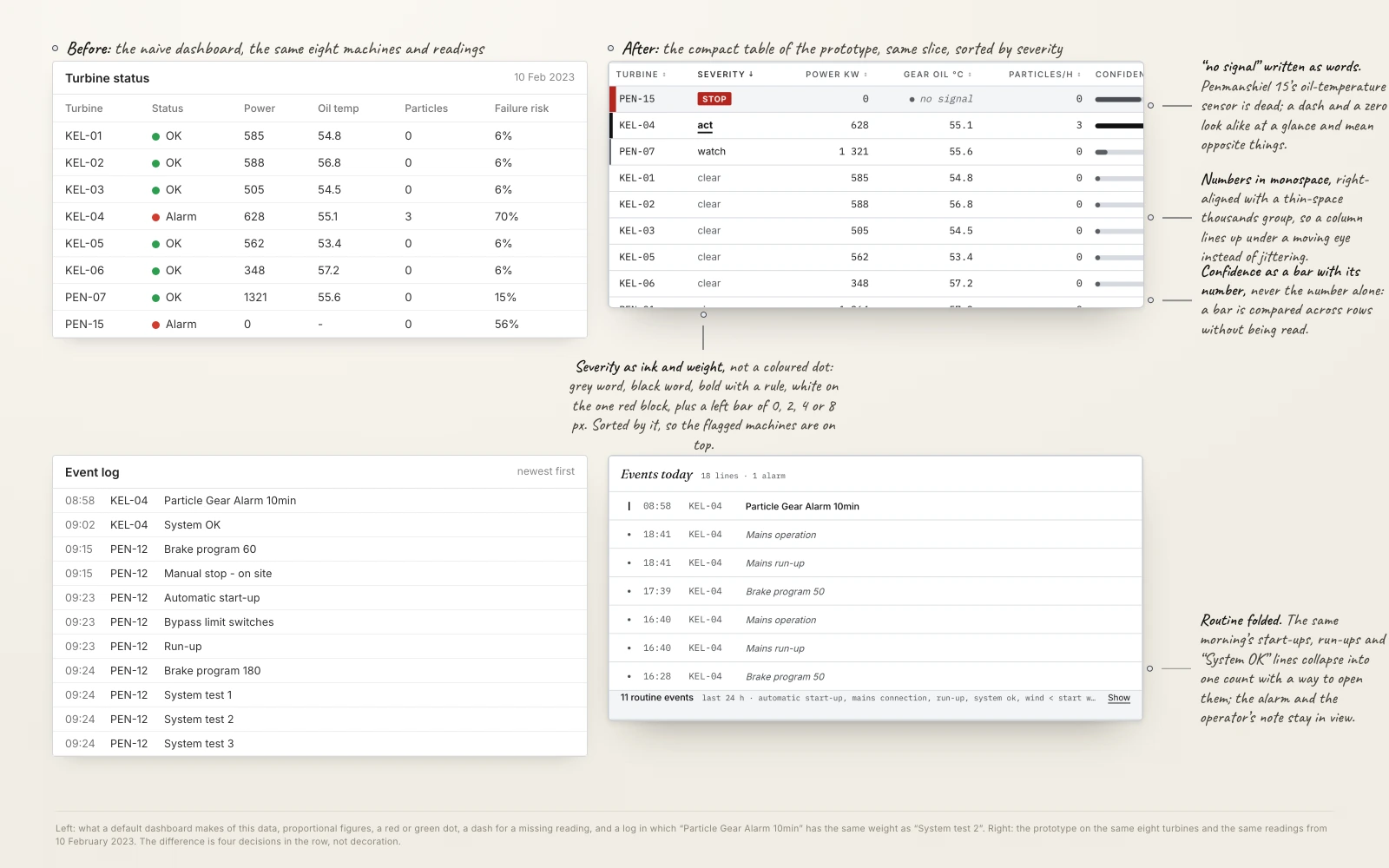
Nine years on six machines produced 504,180 events, about twenty-eight per turbine per day. Sorted by time, which is how an event feed arrives by default, the screen is unreadable in a way that has nothing to do with styling. Five routine messages account for 57.8% of every line ever written: automatic start-up, run-up, system OK, wind below start wind, mains connection. The log spends most of its life reporting that the turbine woke up and there is no wind.
The events that matter are rare in the same window. Across those nine years: fifteen metal particle alarms, seven stops for low gearbox oil pressure costing 203 hours of lost production, six warnings for gearbox bearing temperature. The thing the operator needs is a dozen lines hidden in half a million.
So the naive version fails before any of it is drawn, and four decisions in the row itself carry most of the fix. Numbers set in monospace, right-aligned, so columns line up under a moving eye instead of jittering. Confidence as a bar with the number beside it, never the number alone, because a bar can be compared across rows without being read. A missing reading written as the words “no signal”, because a dash and a zero look alike at a glance and mean opposite things. Severity as ink and weight rather than a coloured dot: a grey word, a black word, bold with a rule, white on the one red block, plus a left bar of 0, 2, 4 or 8 pixels, and the rows sorted by it. The routine lines fold into one count with a way to open them; the alarm and the operator’s note stay in view.
The library exists so one number cannot contradict itself across two screens
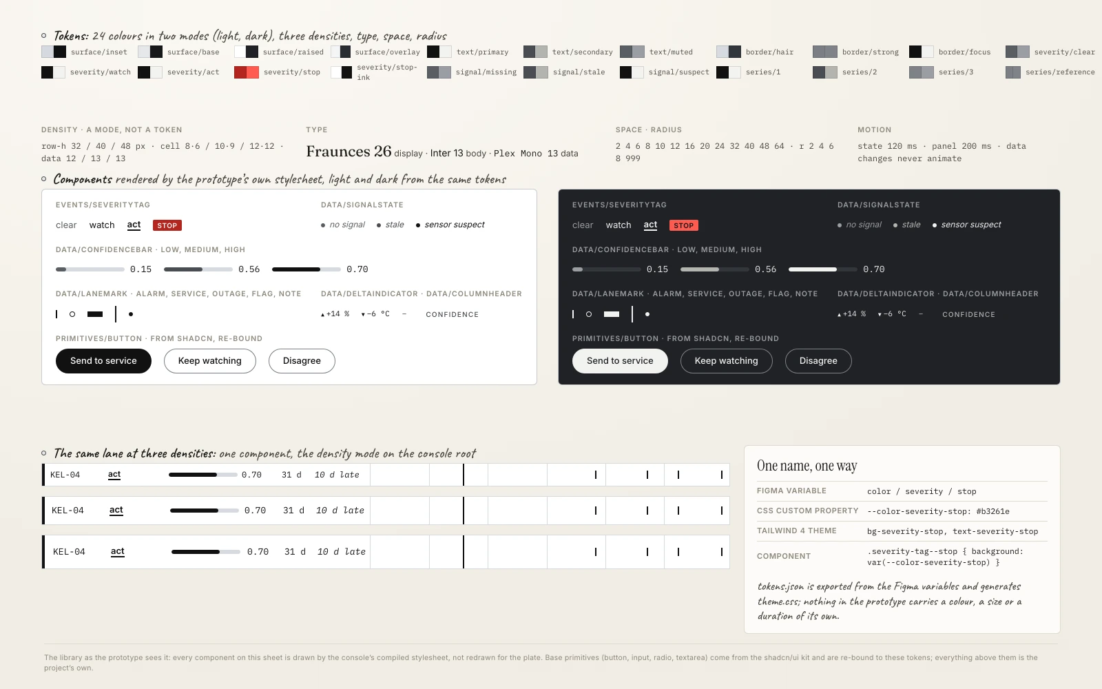
Base primitives come from the shadcn/ui Figma kit, and I did not redraw them. A button, an input, a radio group and a text area are plumbing, and drawing them again proves nothing. Everything the project actually exists for sits above that line and is mine: the row density scale, the lane and its marks, the data cell, the series palette for charts, the confidence bar and panel, the provenance line, the override path and the severity matrix. Twenty-seven component sets in all.
The set is built as variables first and components second. Colour, spacing, type, radius and motion live as Figma variables in six collections, and every component consumes them rather than carrying its own values. Colour is a decision as much as a token: black, white, metallic grey and one red, spent only on STOP, because a red-and-green pair fails colour-blind operators and “clear” has to stay quiet. Two modes come from the same 24 tokens, paper on metal by day and graphite by night, and the console switches at the wind farm’s own sunset. Density is a mode too, so the same lane can be shown at three row heights without a second component.
The chain runs one way and only one way: Figma variables become CSS custom properties, which become a Tailwind theme, which the prototype consumes. The variables are exported to a JSON file that generates the theme; nothing in the code carries a colour, a size or a duration of its own. The library and the running code read from the same source, so a value changed in one place cannot quietly disagree with the other. That is the whole reason the system was drawn before the prototype rather than traced back from it afterwards.
The panel shows what raised the confidence and what lowered it, in that order
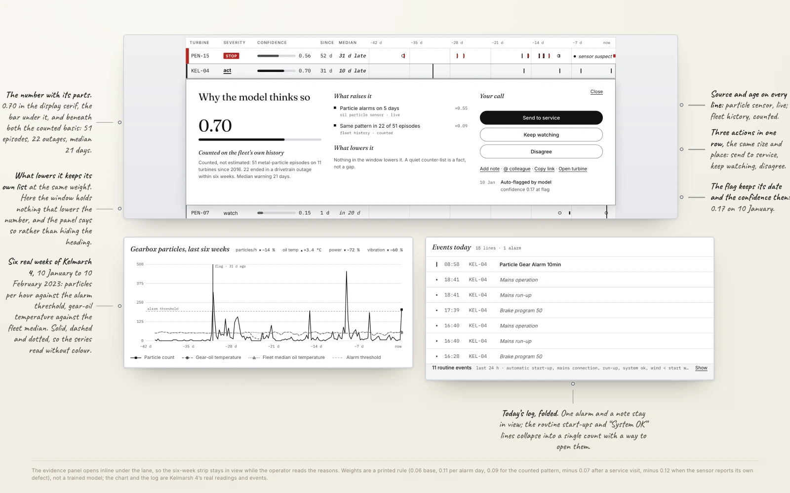
On 10 January 2023 one turbine at Kelmarsh logged a metal particle alarm that lasted five minutes while the machine ran at full power. More followed on 26 January, on 1, 5 and 10 February. On the evening of 10 February the alarm crossed its daily threshold and the turbine stopped itself. Thirty-one days from first signal to forced outage.
That is the case the panel is built for, and it is built to be doubted. It opens inline under the lane, so the six-week strip stays in view. The header carries the confidence in the display serif with its bar. Under it sits the statistical basis in one sentence, quoting the counted numbers rather than a vague claim of experience. Then two lists: what raised the confidence, each signal with its weight, and directly beneath it what lowered it, at the same weight. Counter-evidence is not folded away behind a control, because a reason the operator cannot see is a reason they cannot weigh. When nothing in the window lowers the number, the panel says so instead of hiding the heading.
Every line carries where it came from and how old it is, and a signal that is missing says so in words instead of resolving to zero. The flag keeps its own date and the confidence it had then, 0.17 on 10 January, so the growth of the number is visible. In the prototype the confidence is a printed rule rather than a trained model, a base of 0.06 plus 0.11 for each day with an alarm, plus the counted pattern, minus a recent service visit, minus a sensor that reported its own defect. A real product would replace the rule with a model; the panel would not change, because its job is to show the parts, whatever produces them.
After a month of alarms, the log said the particle sensor itself was broken
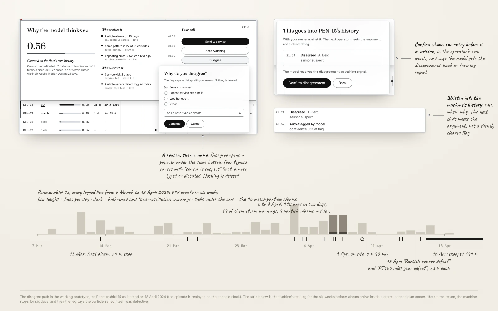
A second machine, at Penmanshiel, ran the same story to a different end. Metal particle alarms on 13, 22 and 23 March 2024, more in early April, some of them arriving in the middle of a storm that filled the same feed with high wind stops and tower oscillation warnings. A technician came on 9 April. The alarms returned after the visit. On 16 April the machine was taken out of service for 141 hours.
Then, on 18 April, the log raised two more warnings: the gear inlet temperature sensor was defective, and so was the particle sensor. After five weeks of alarms, a site visit and six days of downtime, nothing in the record can settle whether there was ever metal in that oil. The prototype replays this episode on its own clock, so both stories can be read on one screen.
This is why the third action is not a courtesy. “Disagree” sits in the same row as “send to service” and “keep watching”, at the same weight, never demoted into a menu. Disagreeing asks for a reason, typed or dictated, with “sensor is suspect” first on the list, shows the entry before it is written, and writes it into the machine’s history with a name against it, so the next operator meets the argument rather than a silently cleared flag. The model gets the disagreement back as training signal. The record of who overruled what, and why, is the part of this product that has to outlive the model.
A dense grid with charts is the hardest accessibility case I have built
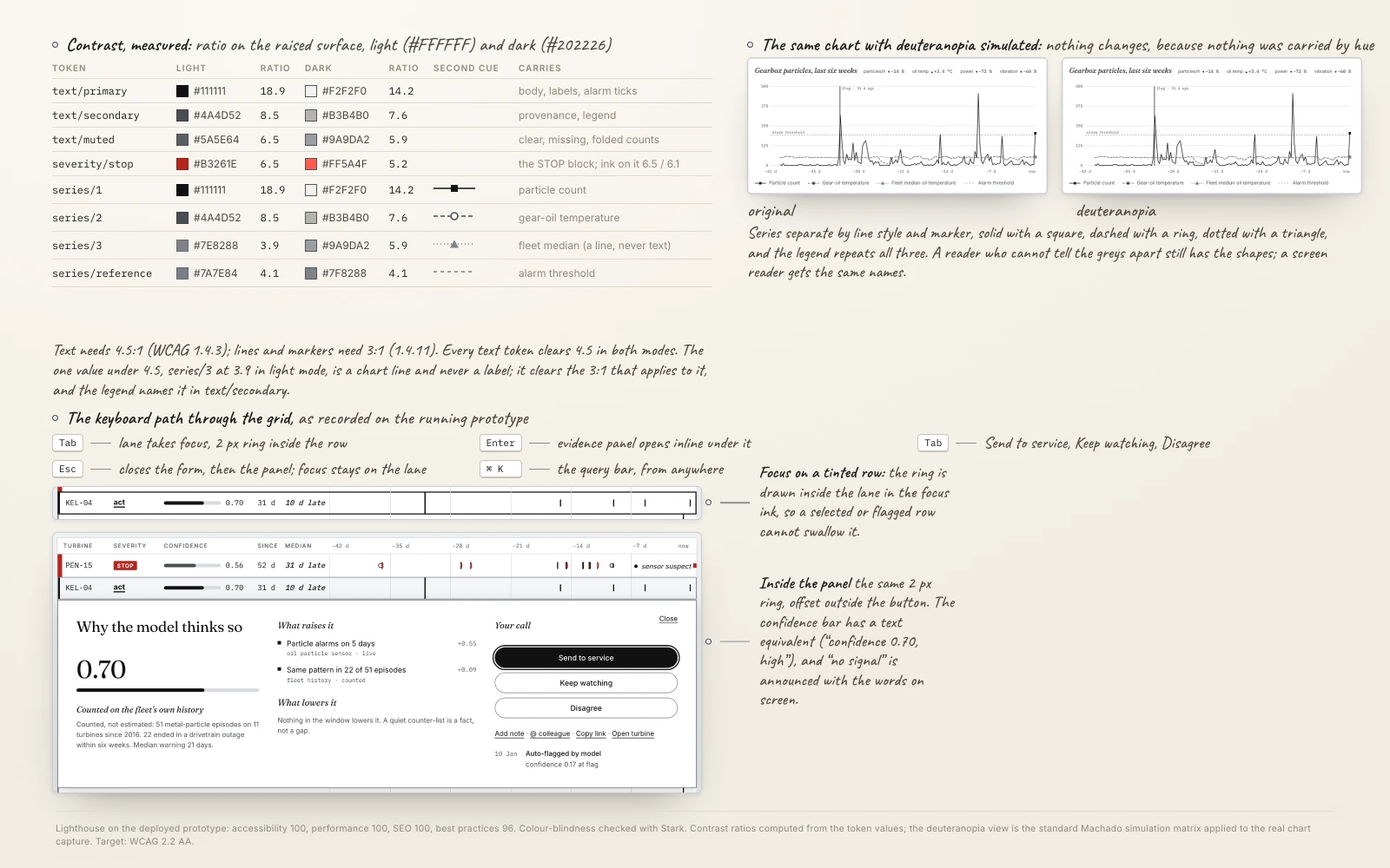
Every page in this portfolio scores 100 for accessibility, and a data grid with charts is a harder case than anything here before it. Two things break first. Chart series that separate only by hue stop working for a significant share of operators, so the series carry a second cue, solid with a square, dashed with a ring, dotted with a triangle, and the legend repeats all three. A monochrome console makes this honest by construction: the same chart under a deuteranopia simulation looks the same, because nothing was carried by hue. And a grid twenty rows deep becomes a keyboard trap unless the path through it is designed, so it is: Tab reaches a lane, Enter opens its panel inline, Tab walks the three actions, Escape closes the form and then the panel with focus back on the lane.
The numbers are measured, not assumed. Every text token clears 4.5 to 1 in both modes; the STOP block reads at 6.5 to 1 in the light mode and 6.1 at night. The one value under 4.5, the fleet-median line at 3.9 in light mode, is a chart line and never a label, and it clears the 3 to 1 that applies to it. The focus ring is drawn inside the lane in the focus ink, so a selected or flagged row cannot swallow it.
The confidence bar has a text equivalent, “confidence 0.70, high”, because a bar that only exists visually is a number withheld. A missing reading announces itself as “no signal” to a screen reader exactly as it reads on screen, which is also what keeps the accessible name matching the visible label. Lighthouse on the deployed prototype: accessibility 100, performance 100, SEO 100, best practices 96. Colour-blindness checked with Stark on the Figma screens. Target: WCAG 2.2 AA.
No operator has used this yet, and that is the first thing I would change
The honest limit of this project is that it has never met the person it is for. Everything above is reasoned from real data and real failure histories, which is a better foundation than taste, and it is still not the same as watching somebody use it at four in the morning.
Four questions would go first. Does anyone press “disagree”, or is it a button that reads well in a case study and dies in production, and if it dies, is that because disagreeing feels risky rather than hard. Does the bar beside the number actually get read faster than the number alone, or does it just look considered. Does “no signal” as a word stop operators from treating a blank as a zero, which is the failure it exists to prevent. And at what confidence does an operator stop watching and send somebody, because that threshold belongs to them and the interface should learn it rather than set it.
A number nobody can argue with is not advice, it is an order.